My Role
Lead Interaction Designer & Researcher
Collaborators
Elvis Towers
Sara Semmoune
Tools
Figma
Adobe Creative Cloud
1. Overview
Background
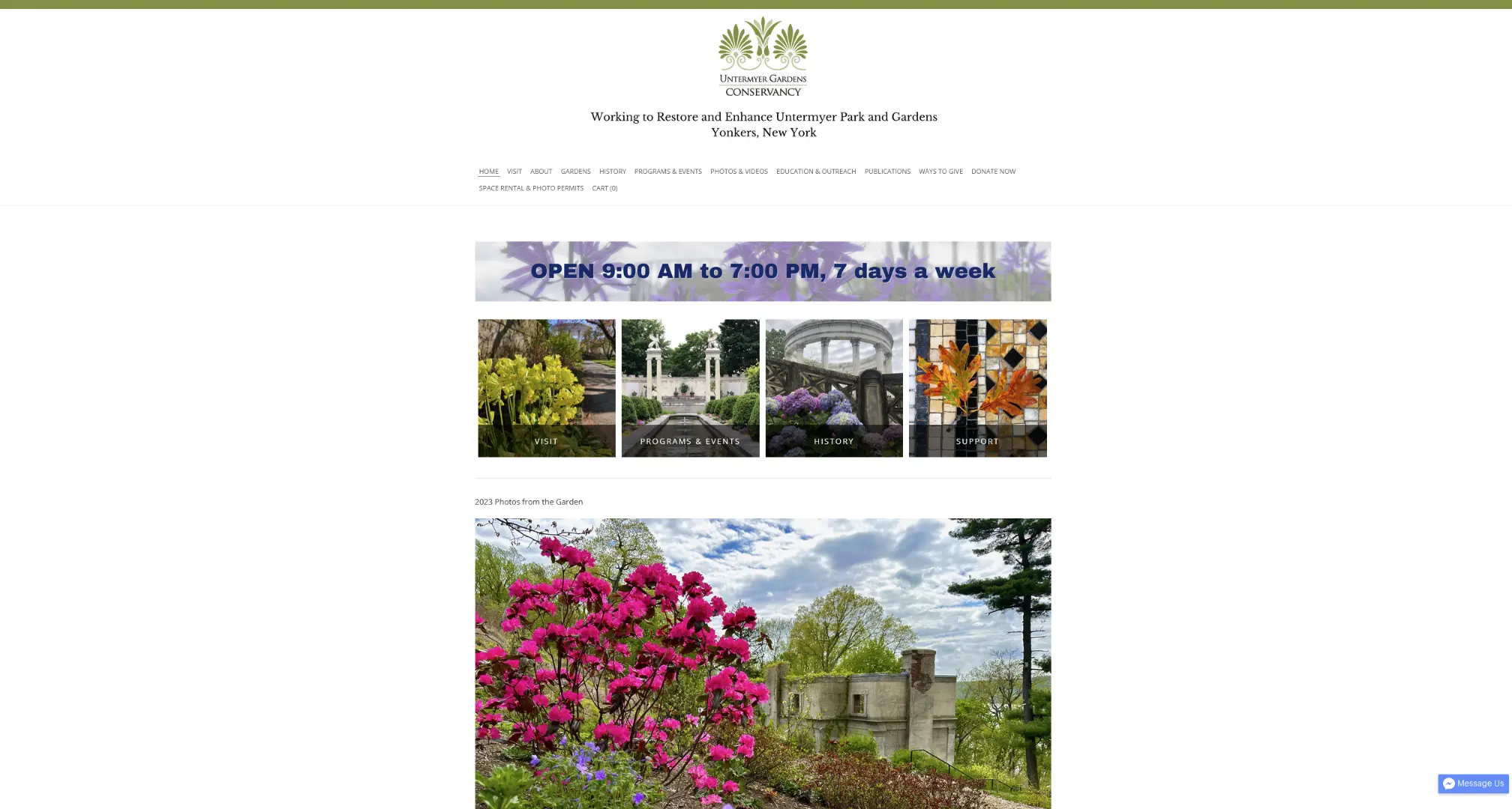
The Untermyer Gardens Conservancy is a 43-acre public garden located in Yonkers, New York. The organization is dedicated to the restoration and preservation of these historic gardens.
The Problem
Our team identified several usability issues with the Untermyer Gardens website that made it difficult for visitors to navigate and find essential information.
Our Solution
We focused on making information more accessible and engaging through a simplified content structure, improving the overall user experience for visitors to the website.
2. Research
Accessibility Testing
We began with a comprehensive heuristic evaluation of the website to assess its compliance with web accessibility standards. Our evaluation revealed several issues:

User Interviews & Research Insights
We conducted five in-depth user interviews, observing how participants interacted with the website naturally. After the initial exploration period, we followed up with targeted questions about their experience.
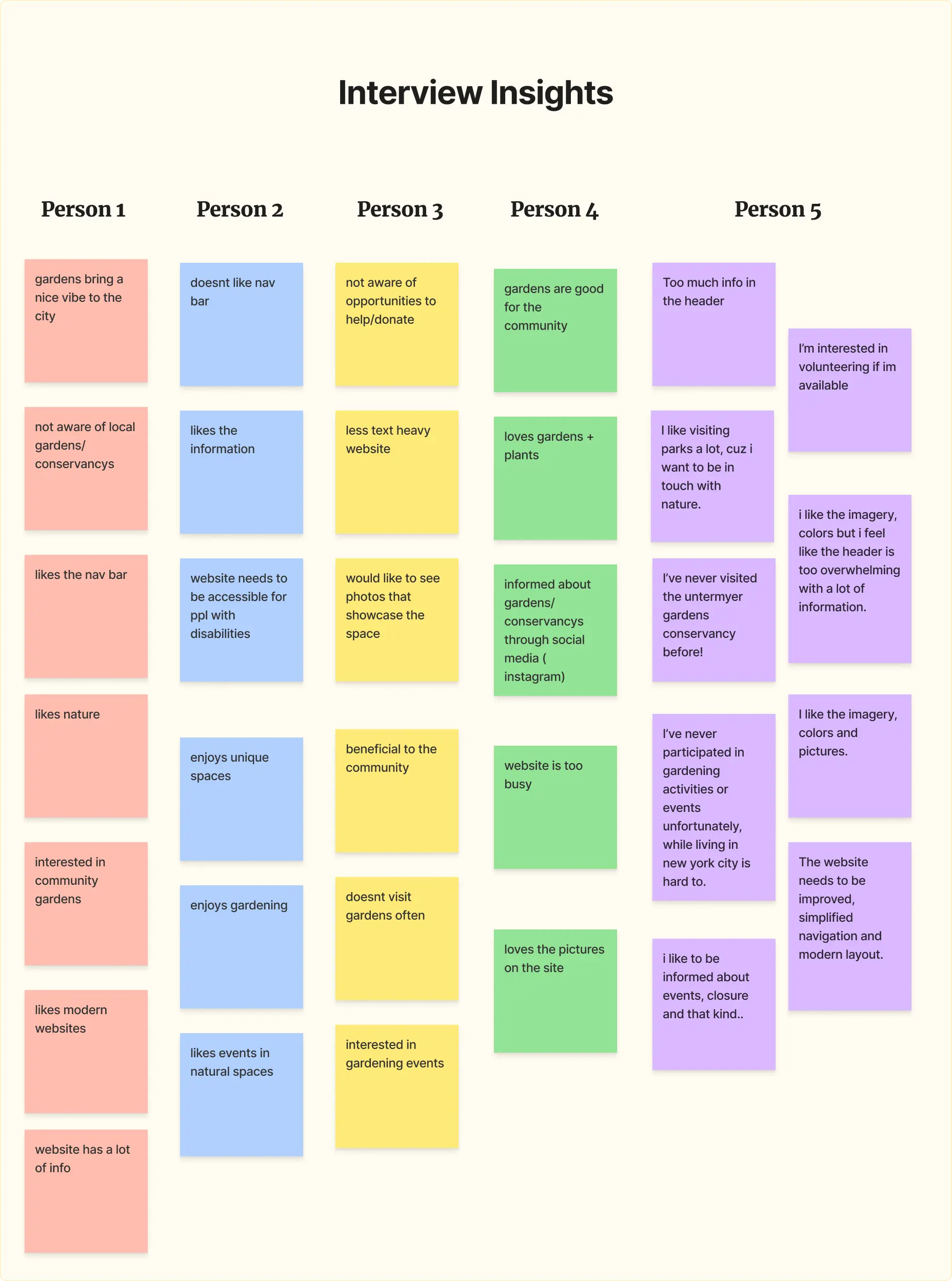
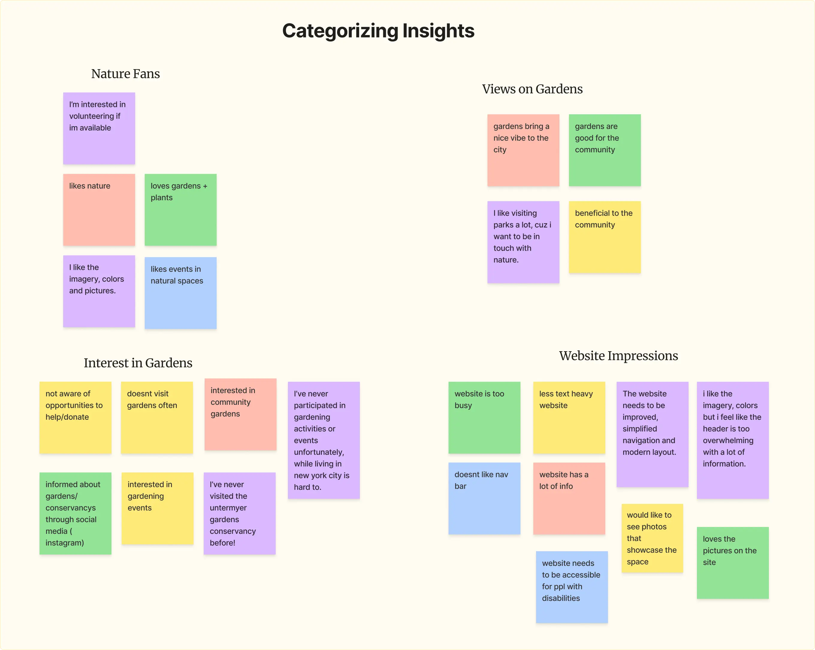
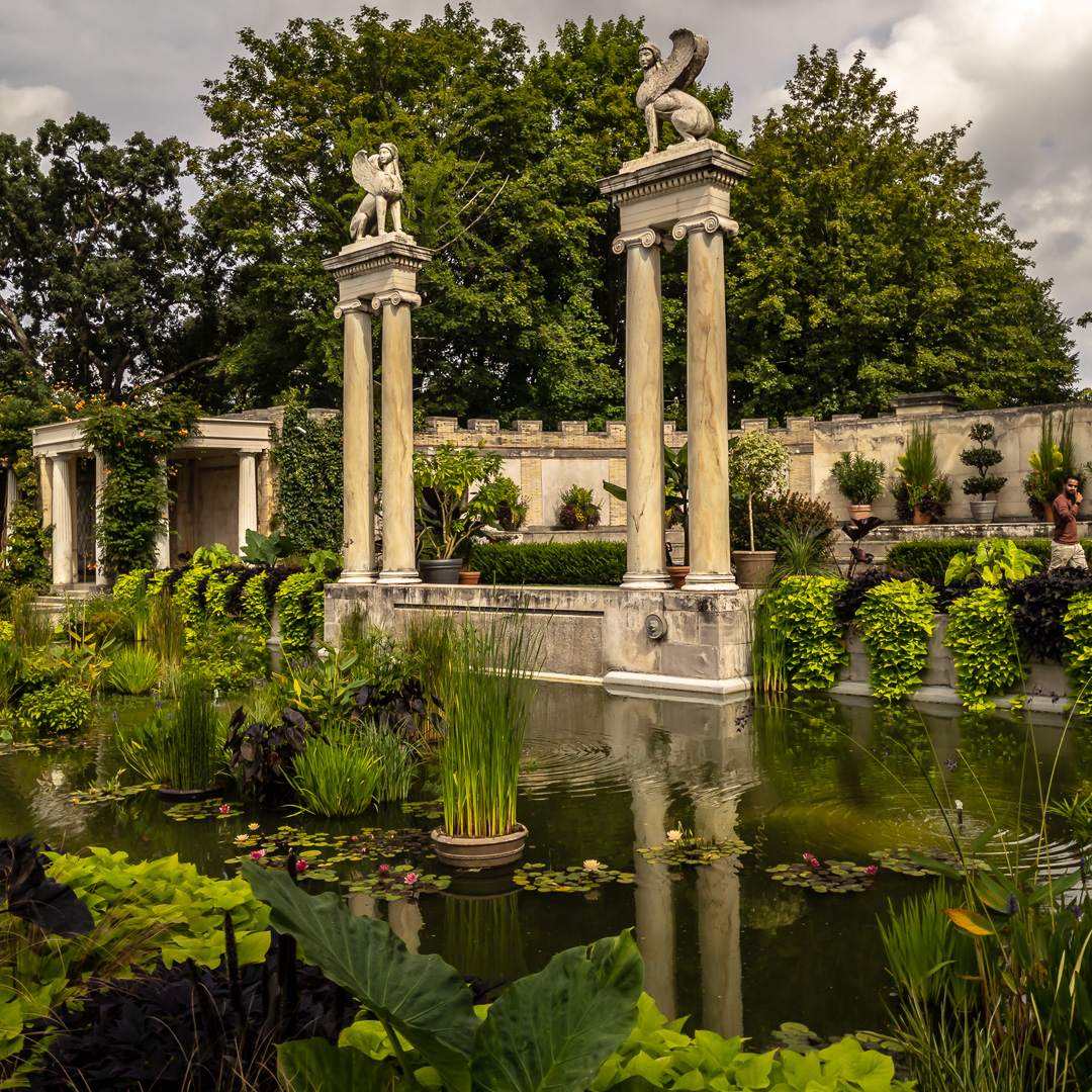
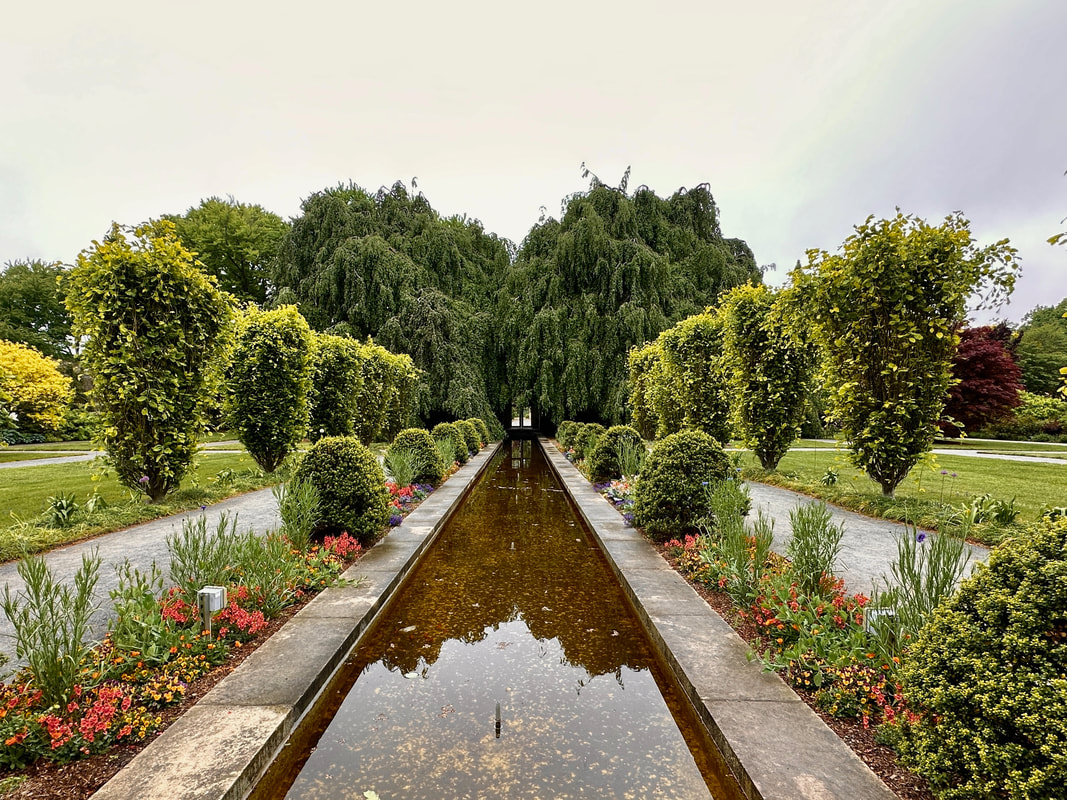
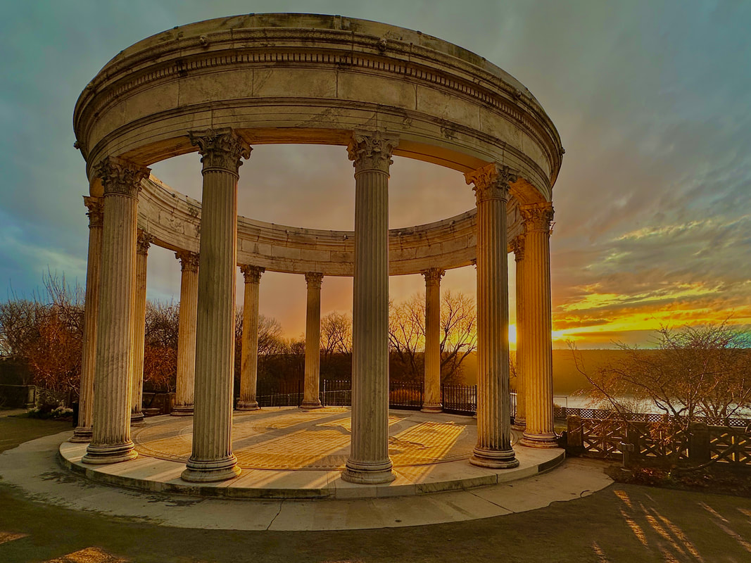
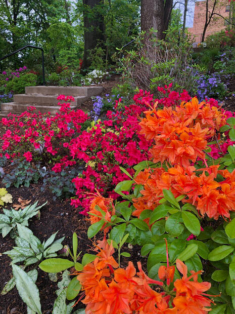
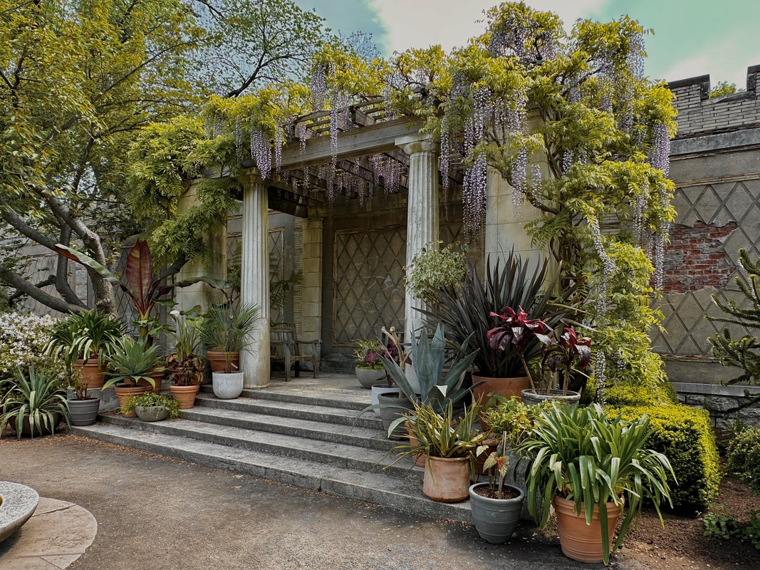
Our research revealed that users found the header overwhelming and certain pages too cluttered with information. However, they consistently praised the quality and quantity of images throughout the site.
User Persona
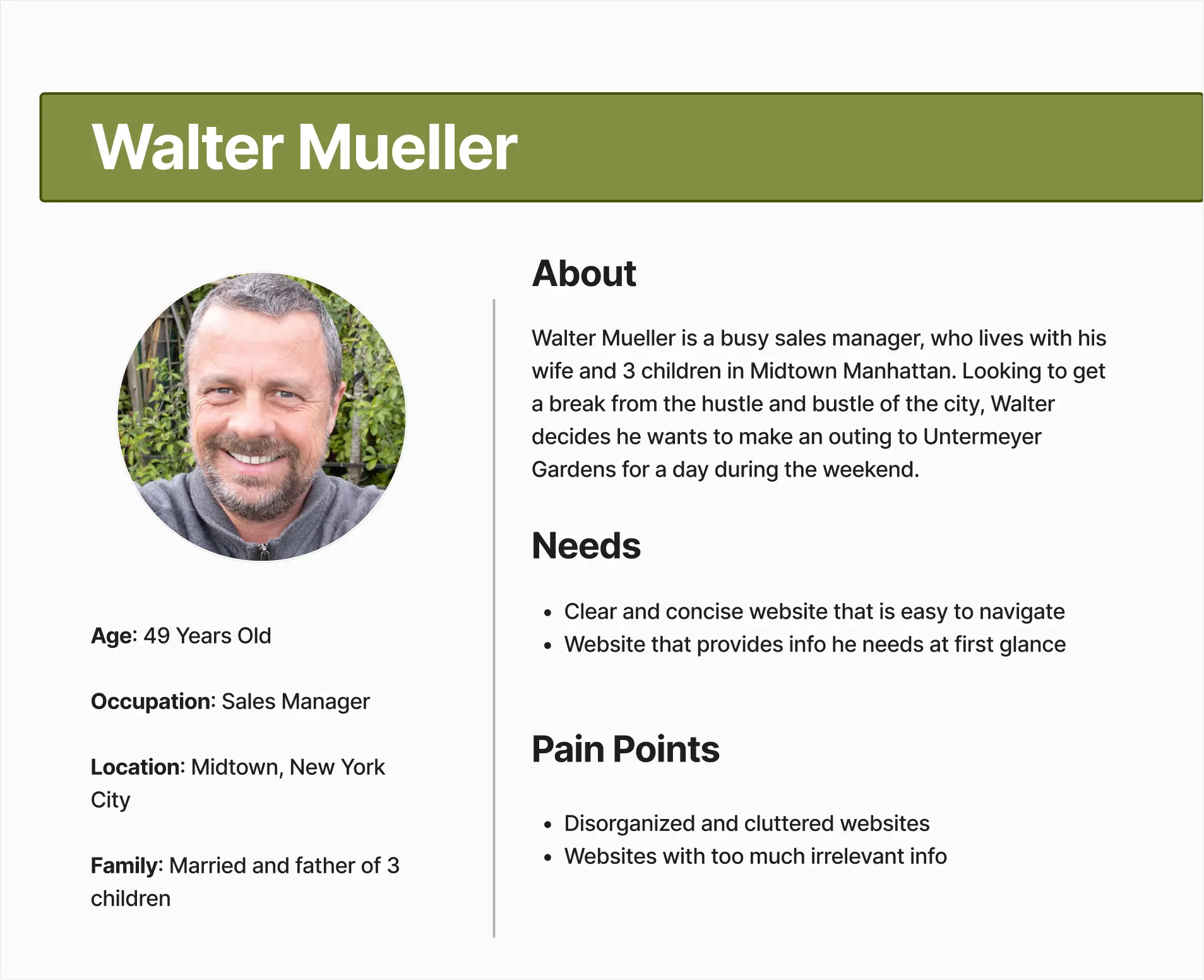
We created Walter's persona to represent our typical user: someone who wants to find essential information about the gardens quickly and efficiently. This persona helped us maintain focus on solving real user needs throughout the design process.
3. Ideation
Feature Prioritization
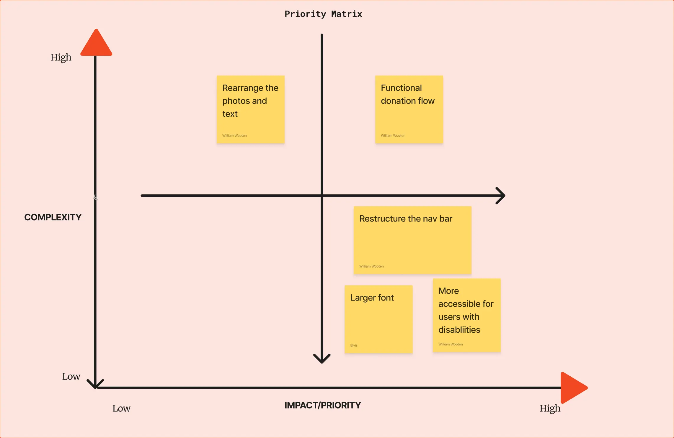
Through careful analysis, our team prioritized the restructuring of the navigation bar to enhance user experience and improve information findability.
We also identified the need to increase font sizes across the site to improve accessibility and readability for all users.
Information Architecture & Card Sorting
Through card sorting exercises with users, we identified key areas for improving the site's navigation structure:
- Consolidated redundant menu items to reduce cognitive load
- Grouped related content into logical categories
- Created clear hierarchies for primary and secondary navigation
- Simplified the path to key information like visiting hours and directions

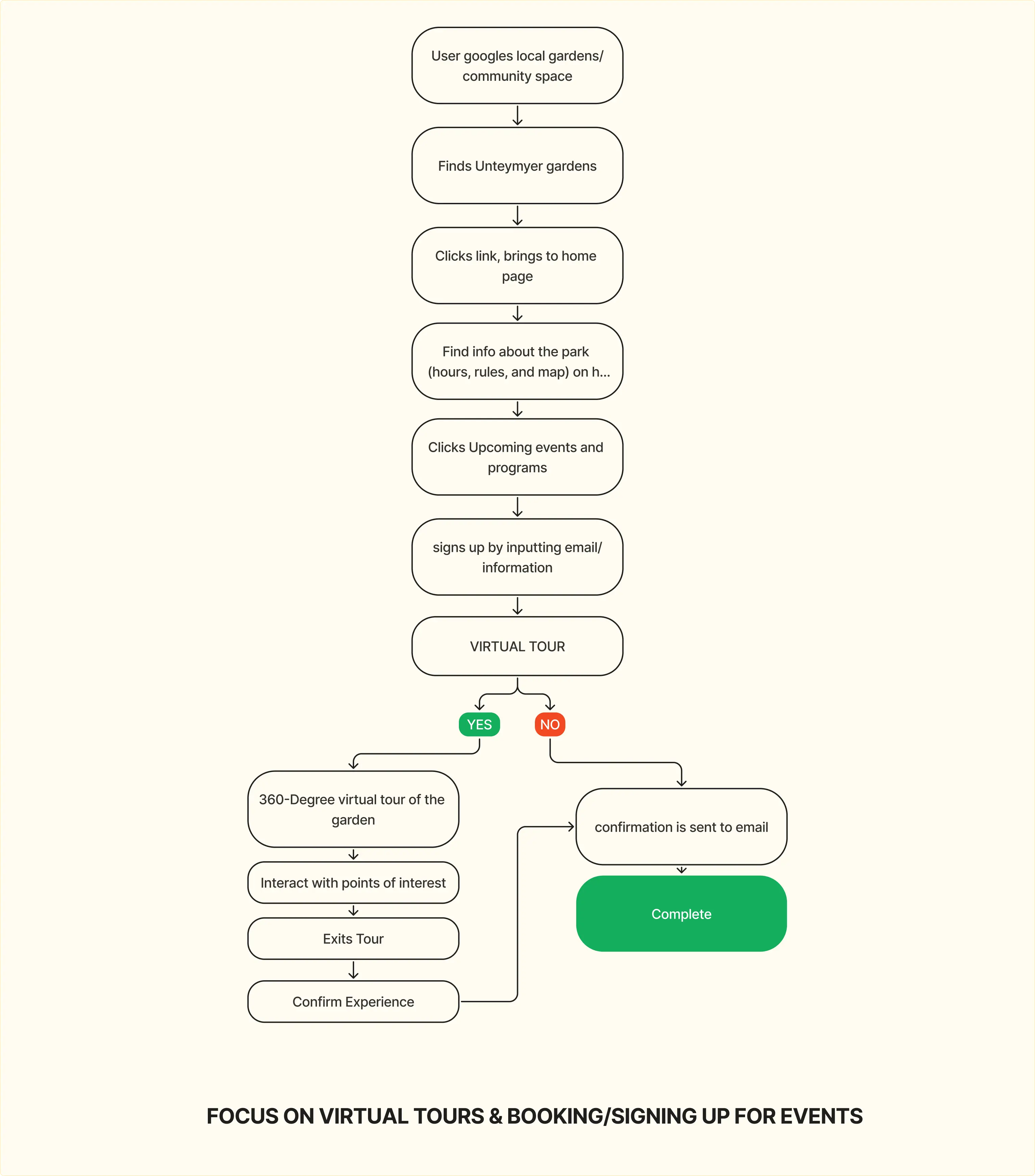
User Flow
We developed a comprehensive user flow to ensure our design decisions aligned with both user needs and stakeholder requirements. A key objective was simplifying the tour booking process and making essential visitor information more accessible.
4. Prototyping
Mid Fidelity Mockup
In our mid-fidelity designs, we focused on:
- Maintaining the original site's aesthetic while improving usability
- Creating clear visual hierarchies to guide users
- Implementing a responsive design that works across devices
- Showcasing the garden's beauty through optimized image placement
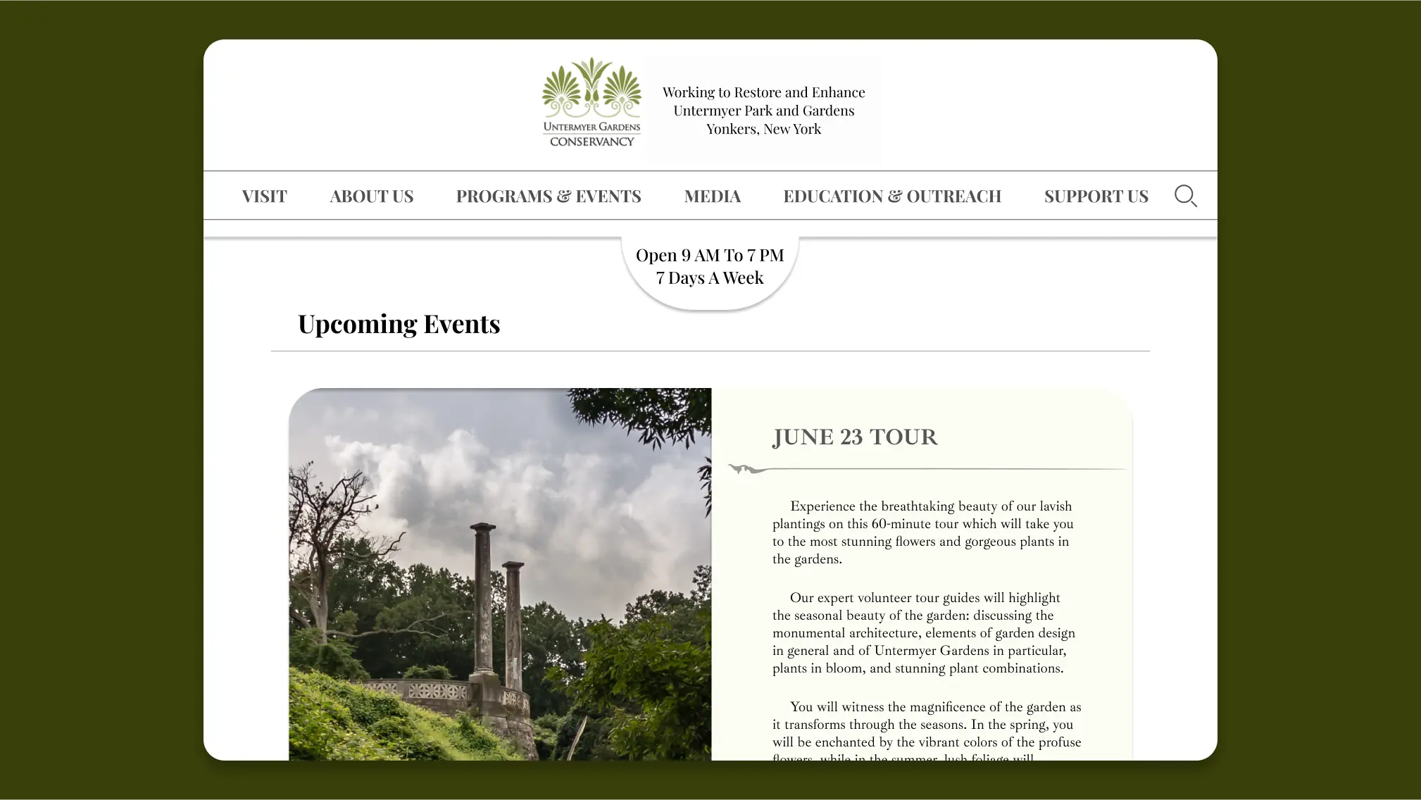
The new navigation bar features dropdown menus to help visitors easily parse options and find what they need. We also prominently featured high-quality images to give visitors a clear preview of the gardens.

5. Testing
Testing Plan
We conducted usability testing with 3 participants to evaluate the effectiveness of our redesigned navigation and overall site experience.
Test Objectives:
- Evaluate the clarity and efficiency of the new navigation structure
- Assess the ease of finding essential visitor information
- Test the responsiveness of the design across different devices
- Gather feedback on the visual presentation and content organization
Key tasks included finding visiting hours, locating the garden map, and accessing event information.
Testing Insights
User Pain Points:
- Map location was still not immediately obvious to users
- Font sizes needed further adjustment for better readability
- Some navigation items weren't consistently clickable
- Main title screen required layout adjustments
- Donation button needed more prominence
- Support section accessibility varied across pages
- Events and programs section needed clearer interaction cues
Positive Feedback:
- Users found the site visually appealing and easy to navigate
- Location and hours information was easily accessible
- Temperature option was appreciated by users
- Image gallery effectively showcased the gardens
- New navigation structure felt more intuitive
Iteration Notes
Based on testing feedback, we implemented several key improvements:
- Enhanced the visibility and accessibility of the garden map
- Increased font sizes across the site for better readability
- Fixed navigation consistency issues across all pages
- Redesigned the donation button for better visibility
- Improved the events and programs section interaction design
- Optimized the main title screen layout
6. Conclusion
High Fidelity Mockup
Key Takeaways
Through this redesign project, we learned several valuable lessons:
- Information architecture has a significant impact on site usability and user satisfaction
- Visual design should support, not overshadow, key user tasks
- Consistent navigation patterns are crucial for user confidence
- Regular user testing is essential for validating design decisions
Next Steps:
- Present findings and recommendations to stakeholders
- Conduct on-site research to better understand the garden experience
- Expand the prototype with additional pages
- Continue user testing to refine the design
- Develop a content strategy for ongoing site maintenance